
Why We Chose Red: The Meaning Behind Our Brand Colour
Unveiling the Colour of Empowerment
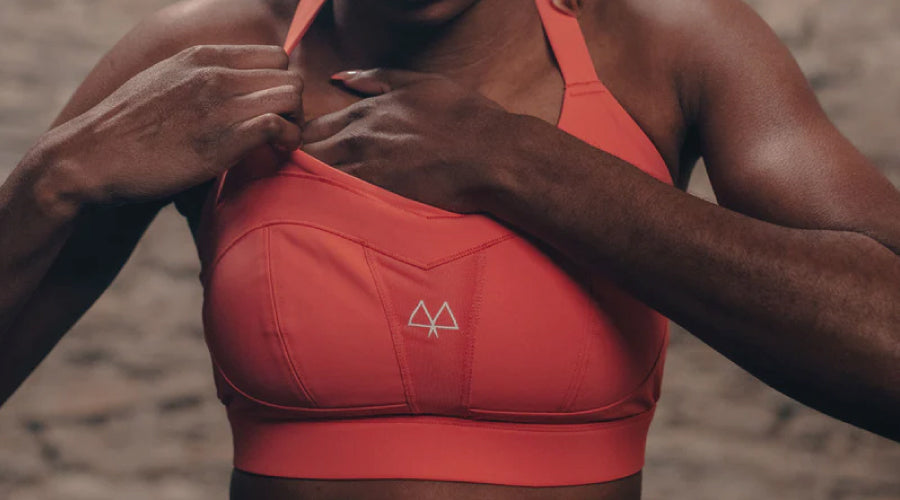
At MAAREE, every aspect of our brand, from the website design to our product packaging, is a reflection of our commitment to empowering women. The choice of our brand colour wasn't just a design decision; it was a journey to find a hue that encapsulates our ethos. This blog post delves into the vibrant world of our chosen colours, red and its nuanced coral variation, unveiling the symbolism and psychology behind our brand's palette.
Red – A Hue of Strength and Vitality
Red, a colour that stands out with its vibrancy, is the cornerstone of our visual identity. It's a colour that resonates with energy, dynamism, and excitement. In the realm of branding, red isn't just a colour; it's a statement of boldness and visibility.
The Rich Symbolism of Red
Red is more than just a colour; it's a symbol of profound emotions and values. It evokes feelings of love, bravery, and resilience. These are the pillars upon which MAAREE is built, and we wanted our visual identity to mirror these core values.
The MAAREE Red – A Testament to Women's Empowerment
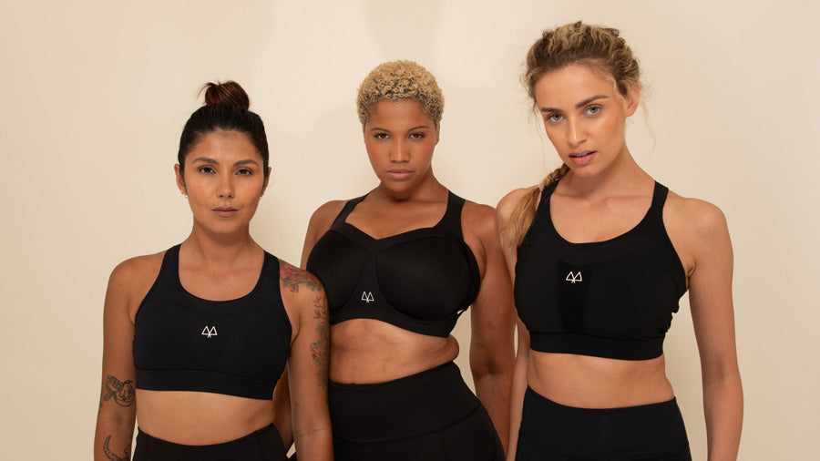
Our brand is a tribute to the strength and confidence of women. We envision our apparel as armor that emboldens women to conquer their challenges. Red, in its essence, aligns seamlessly with this vision, symbolizing power, courage, and unyielding determination.
The Science and Psychology behind Red
Red is not just aesthetically striking; it holds a significant place in the science of colours. It has the longest wavelength, making it highly visible and impactful. Research indicates that red can stimulate a sense of urgency and heightened emotions, aligning perfectly with MAAREE's focus on high-performance sportswear.
Adding a Touch of Femininity: The Coral Influence
While red stands for strength, the infusion of yellow tones softens it to a delicate coral, adding a layer of femininity and grace. This nuanced shade represents the balance between boldness and elegance, mirroring the multifaceted nature of modern women.
Embracing the MAAREE Palette
The selection of red and its coral variation as our brand colours was a thoughtful decision. These colours are not just visually appealing; they are a reflection of our values and the spirit we wish to instill in every woman who wears our apparel. We invite you to embrace our colours and join us in celebrating the power and beauty of women across the globe.
#JoinTheAntiMovementMovement
Through this refined narrative, the blog post now offers a deeper insight into the symbolic significance of MAAREE's brand colours, connecting them with the brand's mission of empowering women in sports.
Want more handy tips?
The sizing checklist Mari runs through in every fitting, plus first dibs on new colours. No spam. Just support that fits.

Blog posts
9 Clear Signs That Your Bra Doesn't Fit You
Wearing the wrong bra size can lead to discomfort and inadequate support. We're here to highlight key indicators such as underband issues, cup problems, and underwire discomfort to help you find a ...
Read more
Women’s Night Match at the French Open: A 3-Year Wait
On the 1st of June, Aryna Sabalenka and Naomi Osaka walked out under the lights at Roland Garros. It was the first time in nearly three years that a women’s match had been given the night session o...
Read more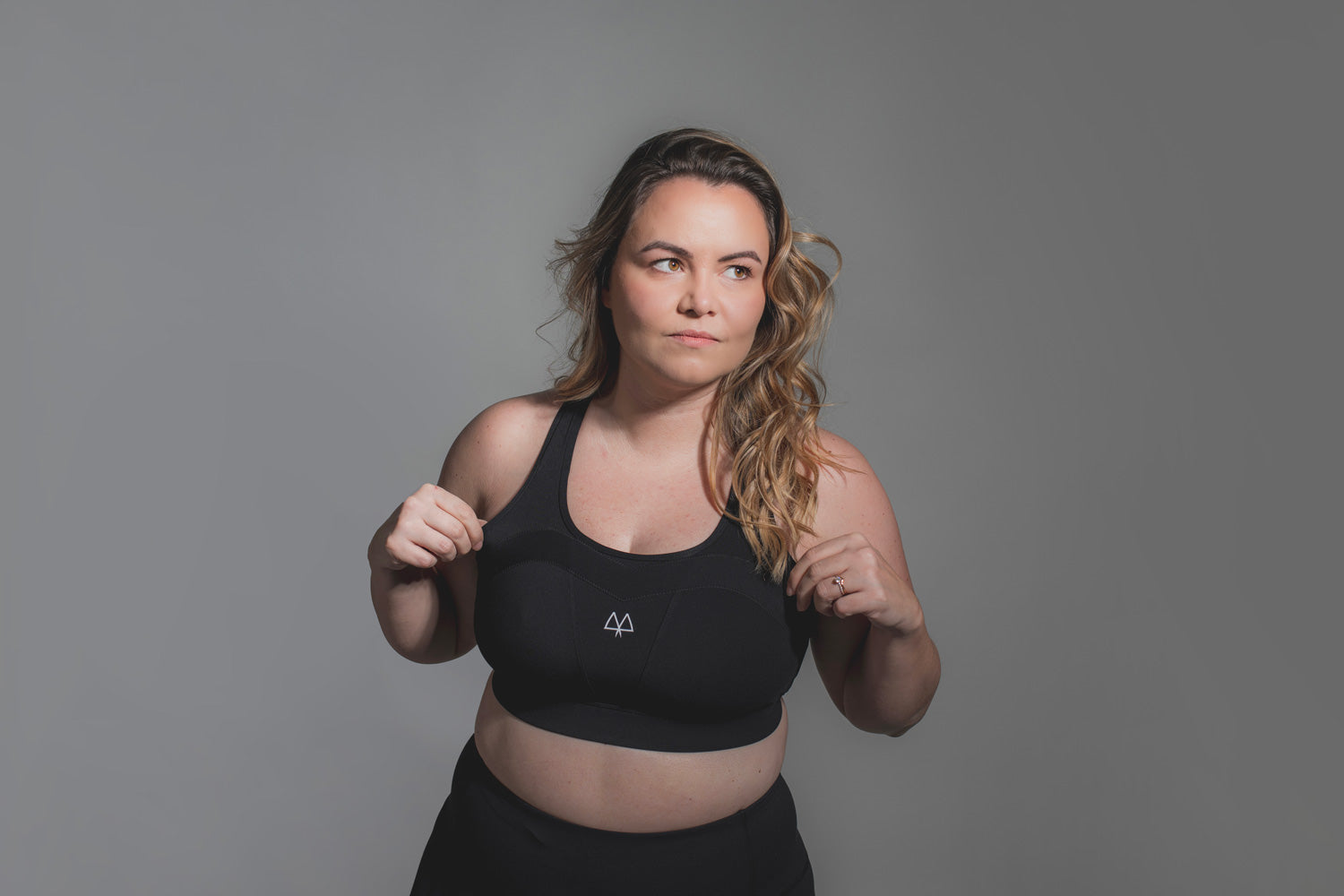
January, we don’t need you to fix us. “New year. New you.”Sorry, says who?Women do not need rebuilding. We don’t need a “before”, and many of us aren’t striving for an after. Movement is continuou...
Read more